Weekly Edit with Katy
The Weekly Edit
This week has been one of those weeks where you notice how interconnected everything is. We've had some wild wind here in Canterbury—nothing directly affecting us, thankfully, but watching the impact on farms and communities around us (north and south) has been a reminder of how fragile things can be, and how much we all need each other.
On a personal level, I'm nearing the end of my first month on my nutrition journey, and I'm learning something important: I'm more depleted than I realized. The good news? I can see the path forward. The challenging news? It's going to take time to turn the ship around. Real, sustained effort. But I'm committed to it, and there's something grounding about knowing exactly what needs to happen.
And then—in the middle of all of this—the business has been beautifully busy. Lovely curtain quotes coming in, a major styling project coming together, and this week we got to attend the Dulux ColourForecast for 2026 presentation. It was exactly the kind of creative, inspiring moment I needed.
So here's what I'm thinking about this week: resilience, restoration, and the colours that are going to define 2026. Let's dive in.
1. Ethereal for 2026
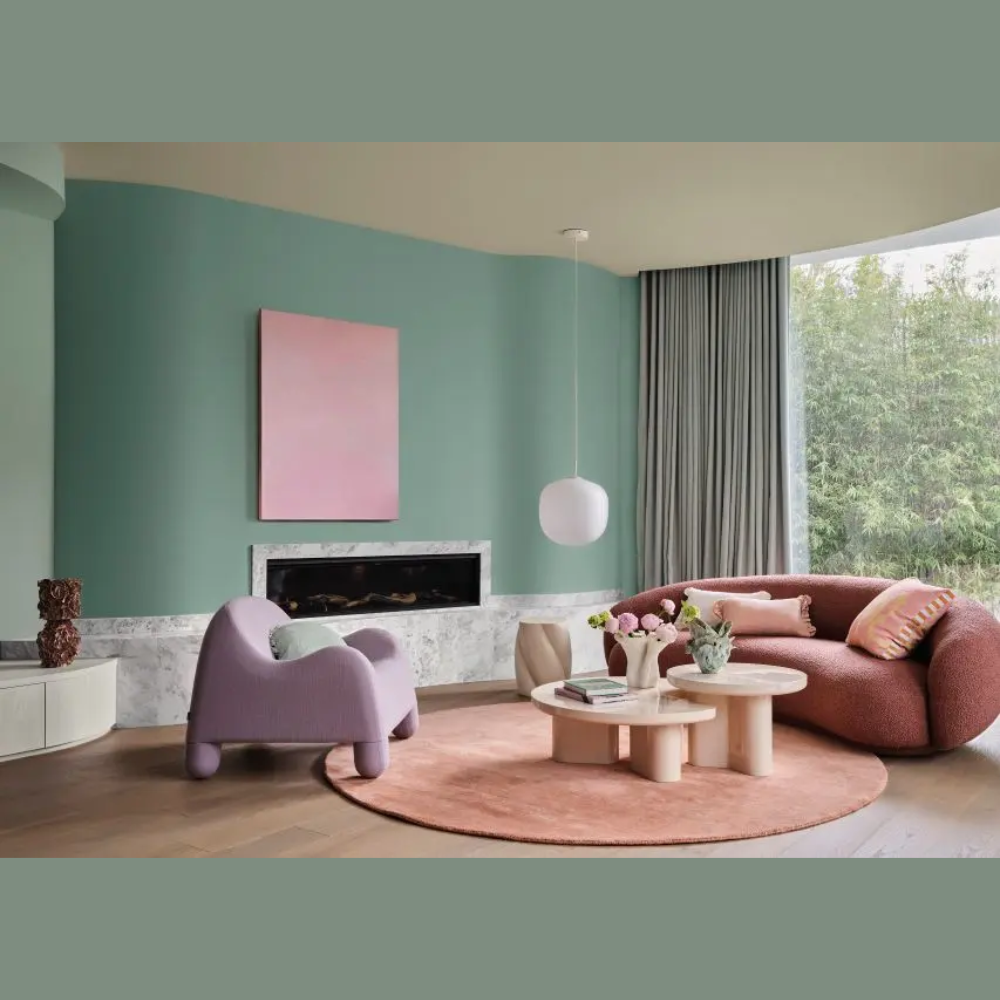
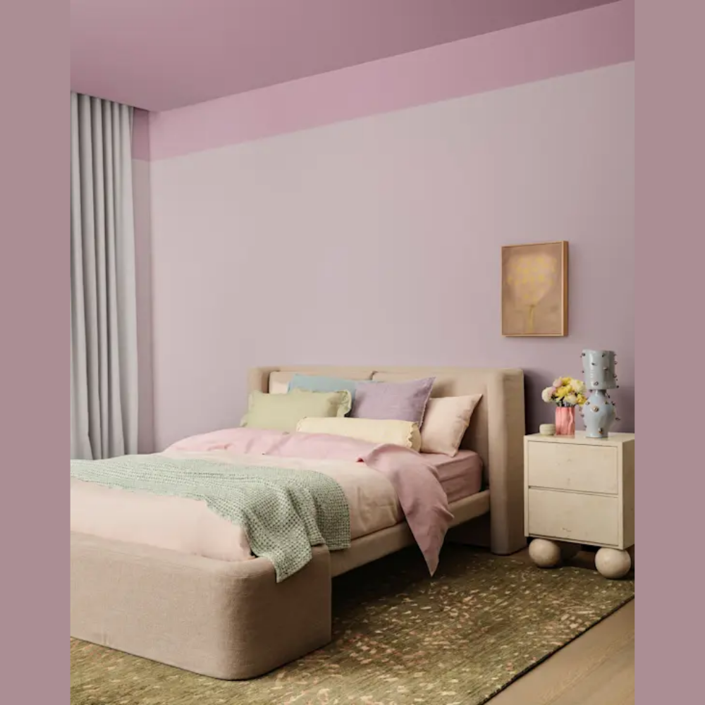
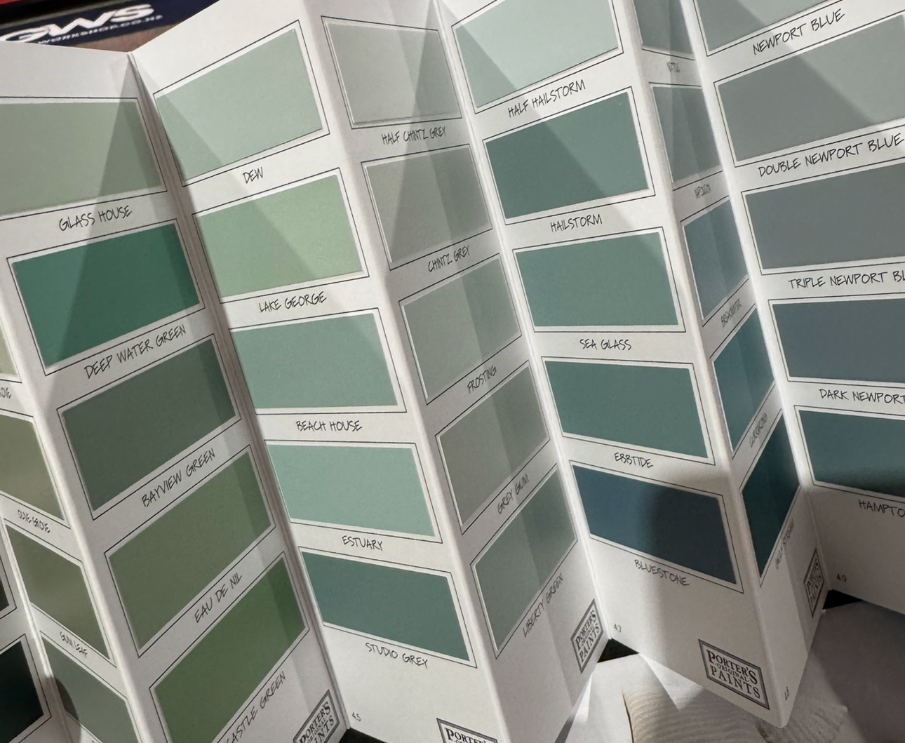
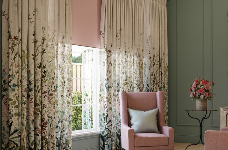
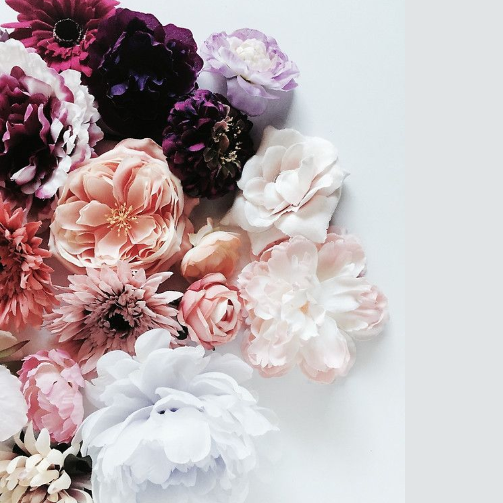
The first theme for 2026 is Ethereal—and it's absolutely beautiful. Dulux describes it as "a gentle, uplifting refuge. A palette inspired by nature, grounded in hope, and designed for emotional restoration."
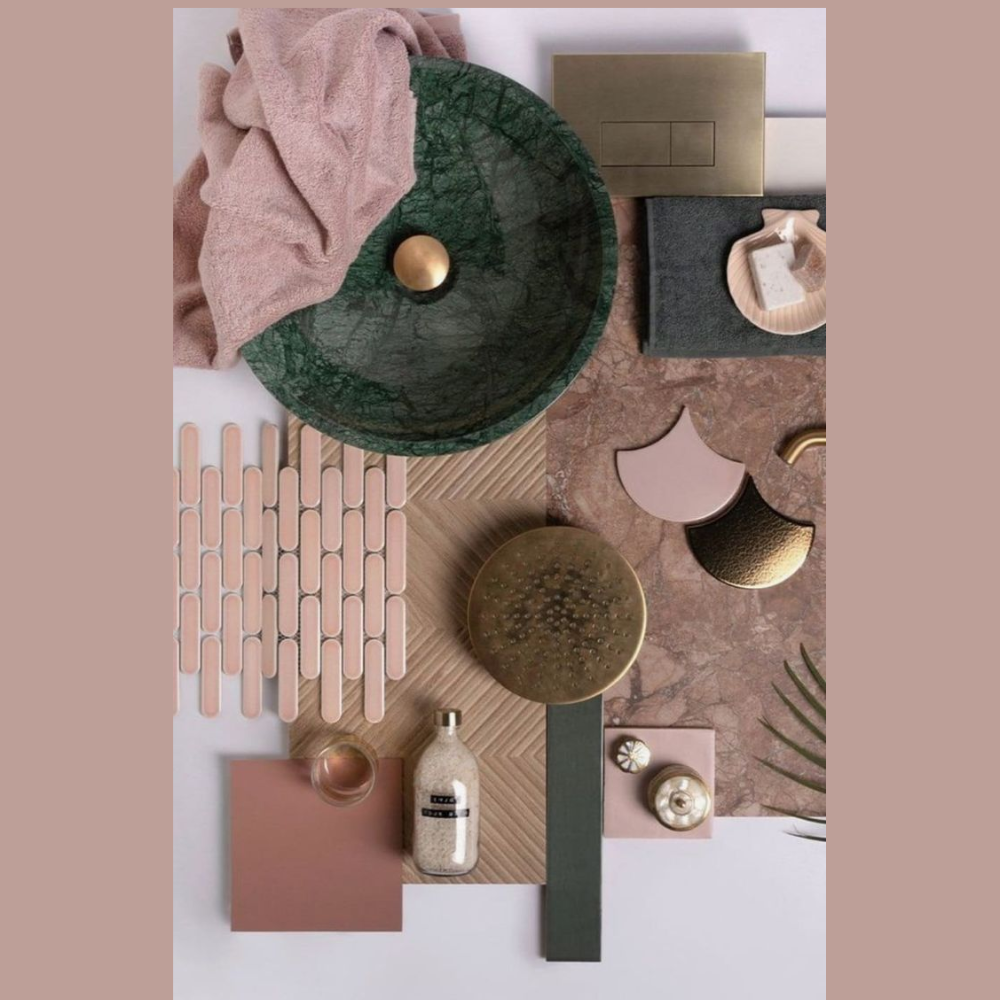
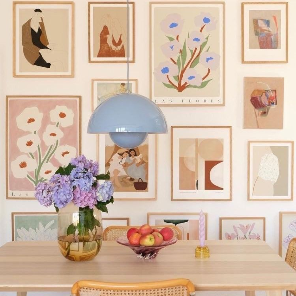
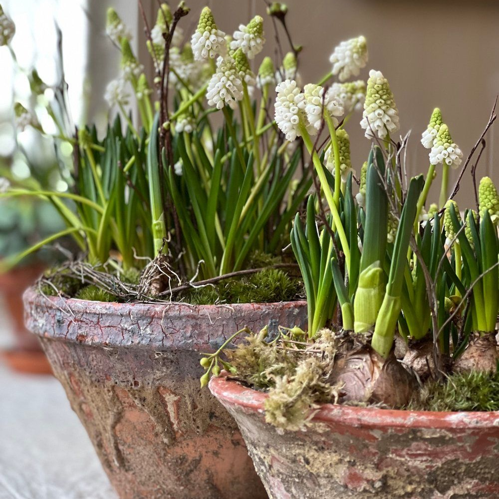
Think soft and mid-tone hues—greens, mauves, and blush pinks—that feel both joyful and restorative. What I love about this palette is that it moves away from the gloomy narrative around climate change and embraces a more hopeful, optimistic outlook instead. It's not escapism; it's hope.
After the week we've had—wind, uncertainty, the heaviness of depletion—there's something deeply powerful about a palette that's grounded in hope and designed for restoration. These aren't just pretty colours; they're colours with purpose and meaning.
For your home: If you're craving calm, restoration, and a sense of hope, Ethereal is your palette. These colours invite you to slow down, breathe, and remember that beauty and renewal are always possible.
2. Soft Colour Use
Here's something I've learned after years of designing in Canterbury: soft colours can be tricky in our climate. In England, those pale pinks, soft greens, and whisper-whites look absolutely dreamy. Here? They can sometimes feel washed out or flat—especially in rooms with strong, direct sunlight.
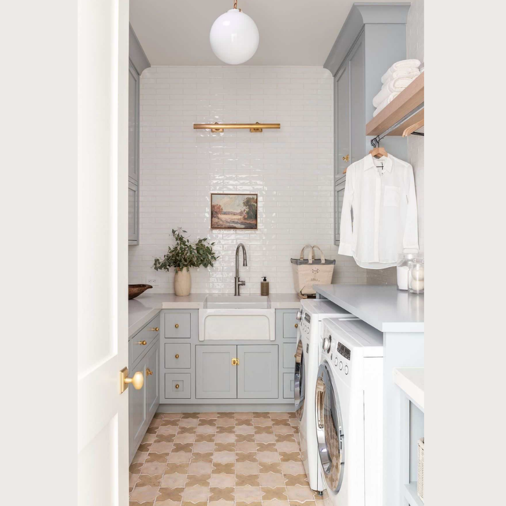
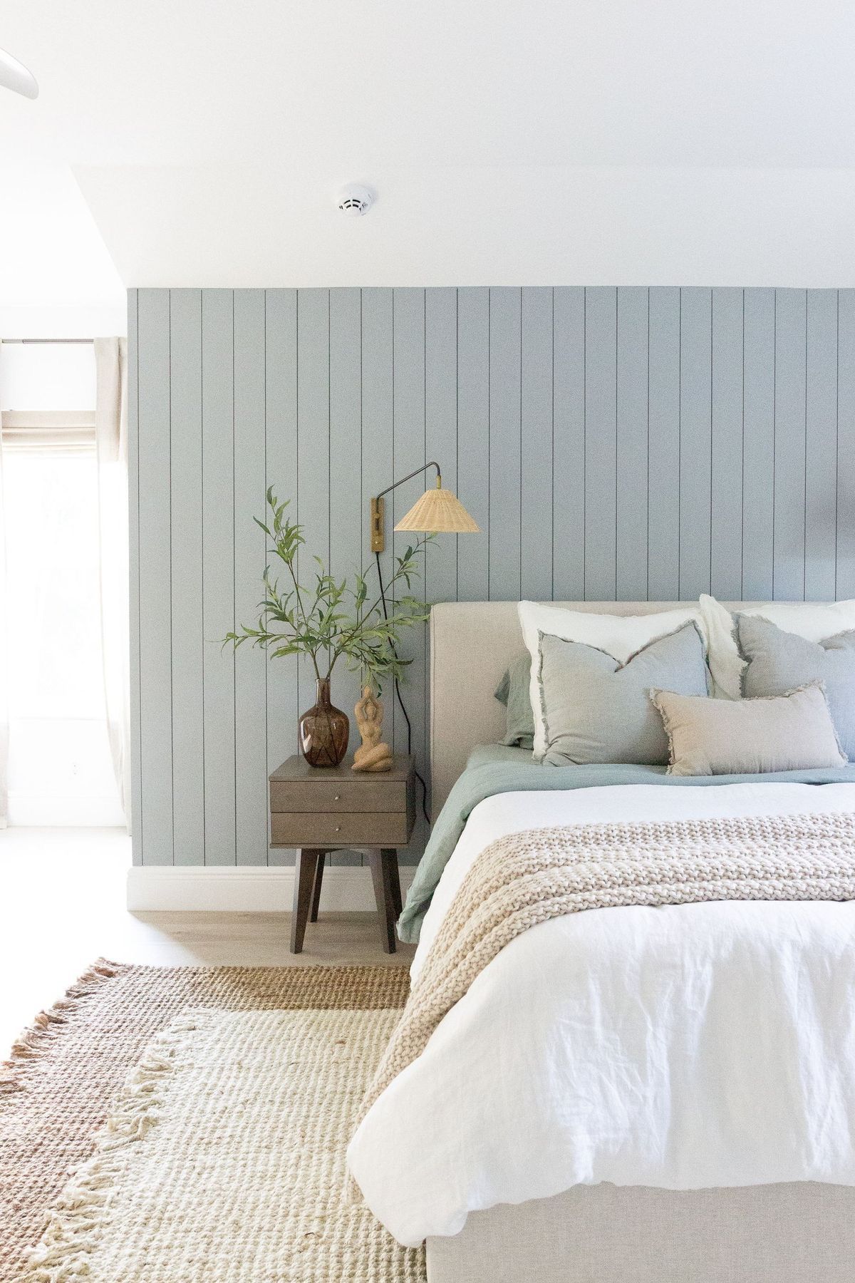
But here's the good news: soft colours can absolutely be your neutrals. If you're thinking white, consider a soft blush, a pale sage green, or a gentle grey instead. These colours have the same neutral, versatile quality as white—they work with almost everything—but they have depth and character.
The trick: When using soft colours in strong sun, pair them with:
- Richer accent colours (jewel tones, deeper shades) to add contrast and prevent washout
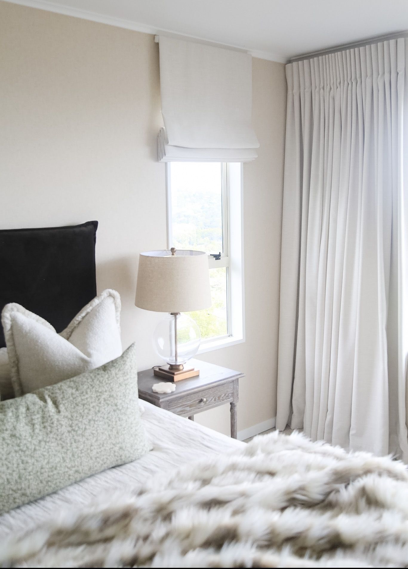
- Textured fabrics (linen, wool, natural weaves) that catch light beautifully
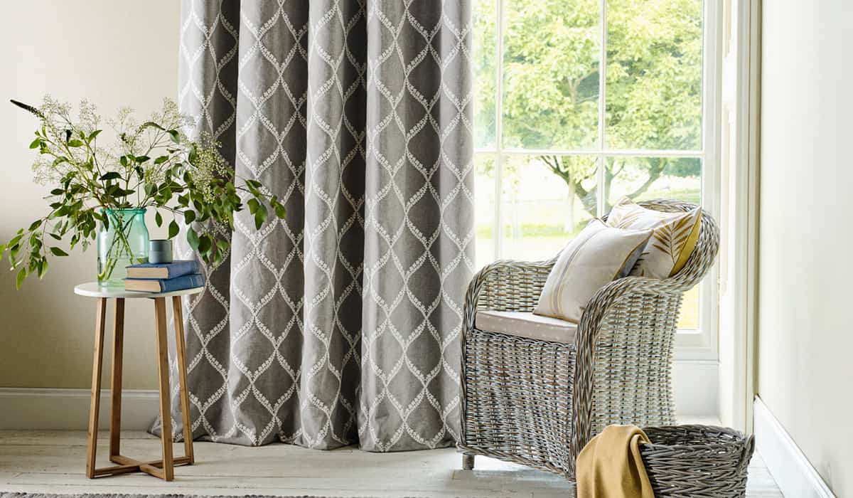
- Good window treatments (quality linings and curtains) that control light and protect colour saturation
- Layered lighting (not just relying on natural light)
Soft colours aren't just for cool climates—they just need a little more thought and intention here in Aotearoa. And that's when they become truly special.
3. The Growth Gap
I've been thinking a lot about growth lately. Not just in business, but in life. In health. In how I show up for myself and the people I love. There's a concept I came across recently called "the growth gap"—the space between where you are and where you want to be. And here's the thing: growth almost always requires stepping into discomfort.
Right now, I'm in that space. Changing my nutrition, rebuilding my health, learning to balance rest with busyness, trying to refresh and restore while the business demands my energy. It's uncomfortable. Some days it feels impossible. But I'm starting to understand that this discomfort? It's not a sign I'm doing it wrong. It's a sign I'm doing it differently—and different is where growth lives.
I don't have it figured out. I'm not going to wake up tomorrow magically healed or perfectly balanced. But I'm willing to be uncomfortable for a while, because on the other side of that discomfort is a version of myself I want to become.
If you're in your own growth gap right now—whether that's health, business, creativity, or life—you're not alone. And the discomfort? That's just proof you're expanding.
4. Katy's Mini Edit
Loving for 2025
Attending the Dulux Colour Forecast presentation and being surrounded by creative energy. There's something so energizing about being in a room full of designers all inspired by the same colour stories.
Design Tip
Soft colours aren't boring—they're just neutrals with personality. Use them as your base and layer in richer accents to keep them from feeling flat.
Excited About...
A long weekend ahead! Time to tackle those spring chores AND actually wind down. I'm planning to do both—and maybe prioritize the wind-down part more than usual.
